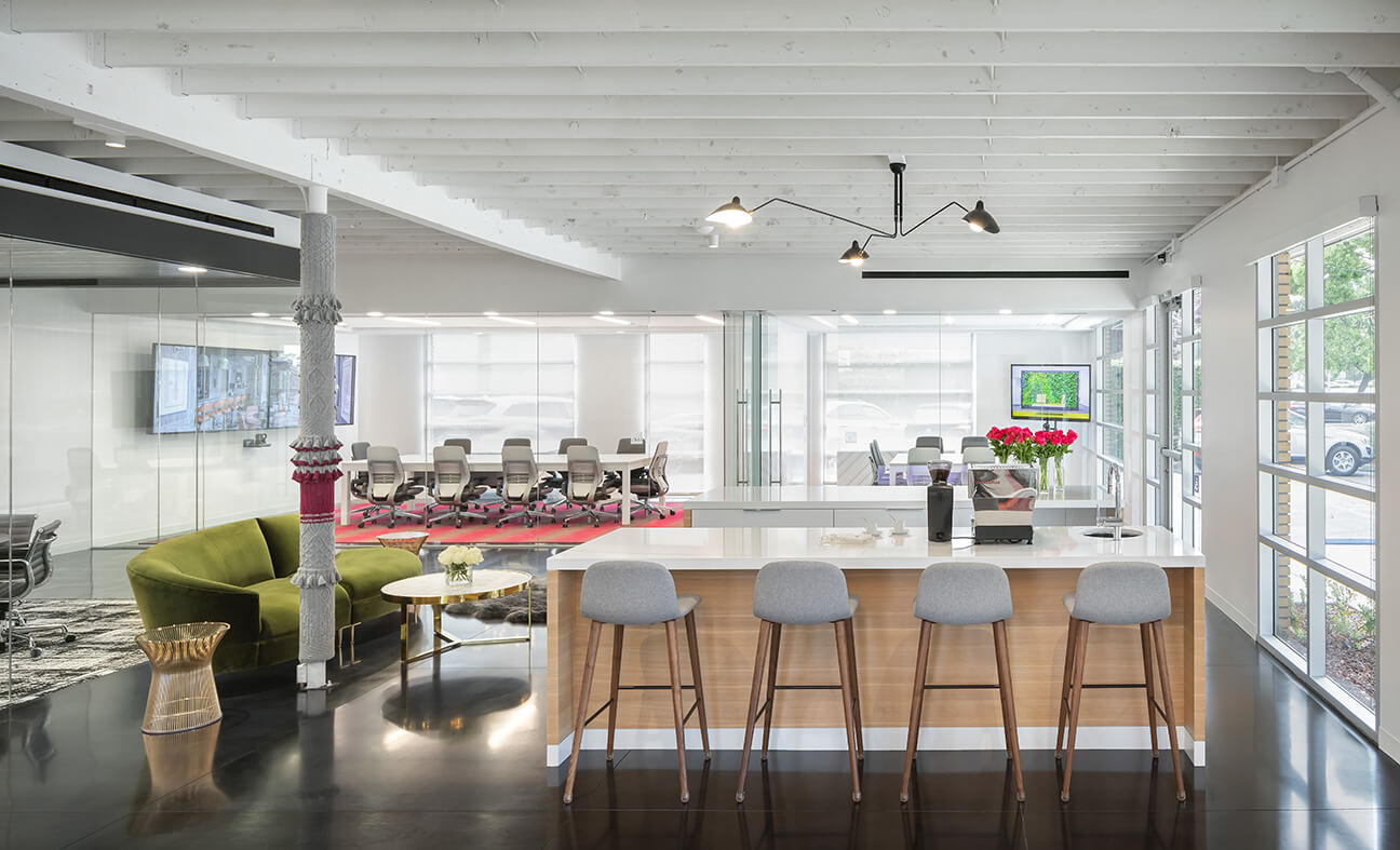
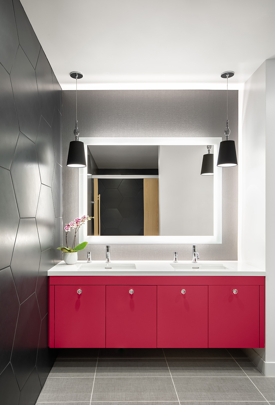
Our Silicon Valley office was designed with an open, inspiring layout that supports collaborative work, employee wellbeing, and continued growth. Moving from a traditional office suite in a multi-tenant building to a small, single-story structure presented a unique opportunity to create a dynamic workplace that showcases the quality craftsmanship reflective of the work performed for our Silicon Valley clientele.
Originally constructed in 1967, the nondescript office building with large windows and high ceilings was in desperate need of a refresh. The now renovated interior, which was designed and built by our firm to meet the WELL Building Standard, features healthy building materials and furnishings with low-emitting volatile organic compounds, specialized air filters to remove pollutants, a filtered water station, ergonomic furniture, access to daylight, and biophilic design elements throughout the space.
Many of the standards established during the design and construction of our headquarters in San Francisco were utilized for the new Silicon Valley office such as workstations with sit-stand desks, adjustable monitors, and adjustable task chairs, as well as some ancillary pieces. While there are similarities between the two spaces, the Silicon Valley office has its own distinct identity, and special features and finishes were selected to complement its unique design.
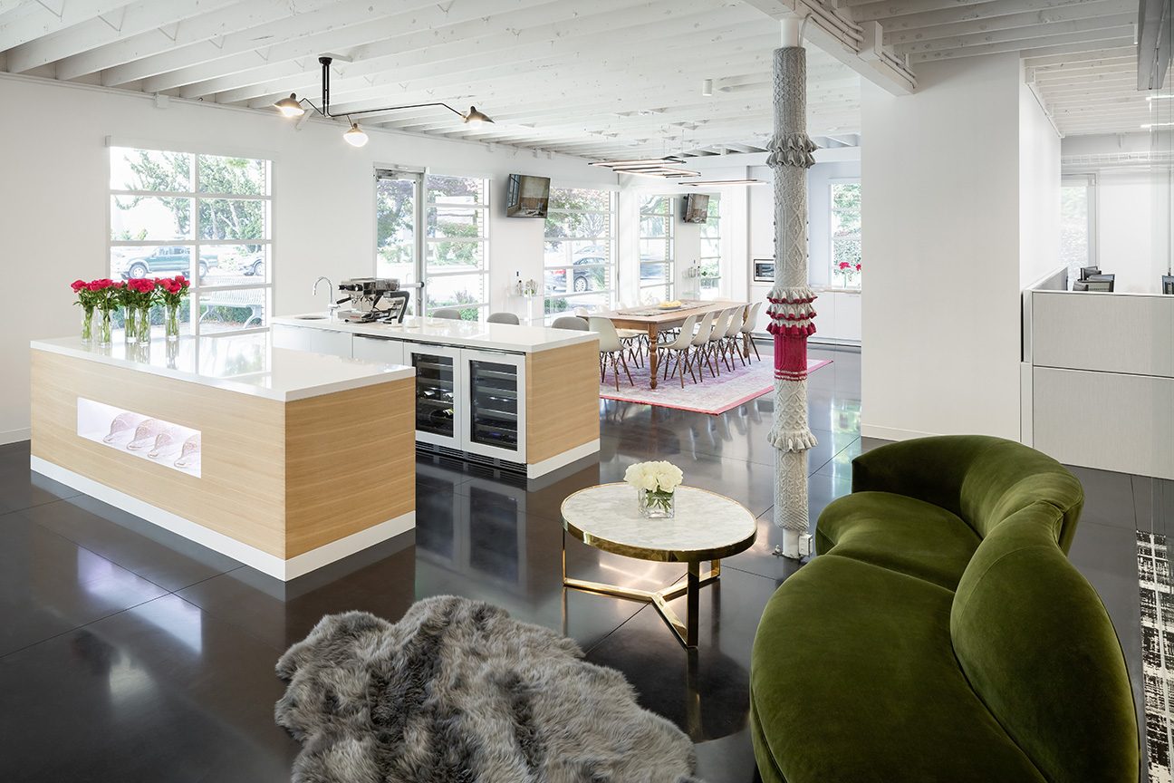
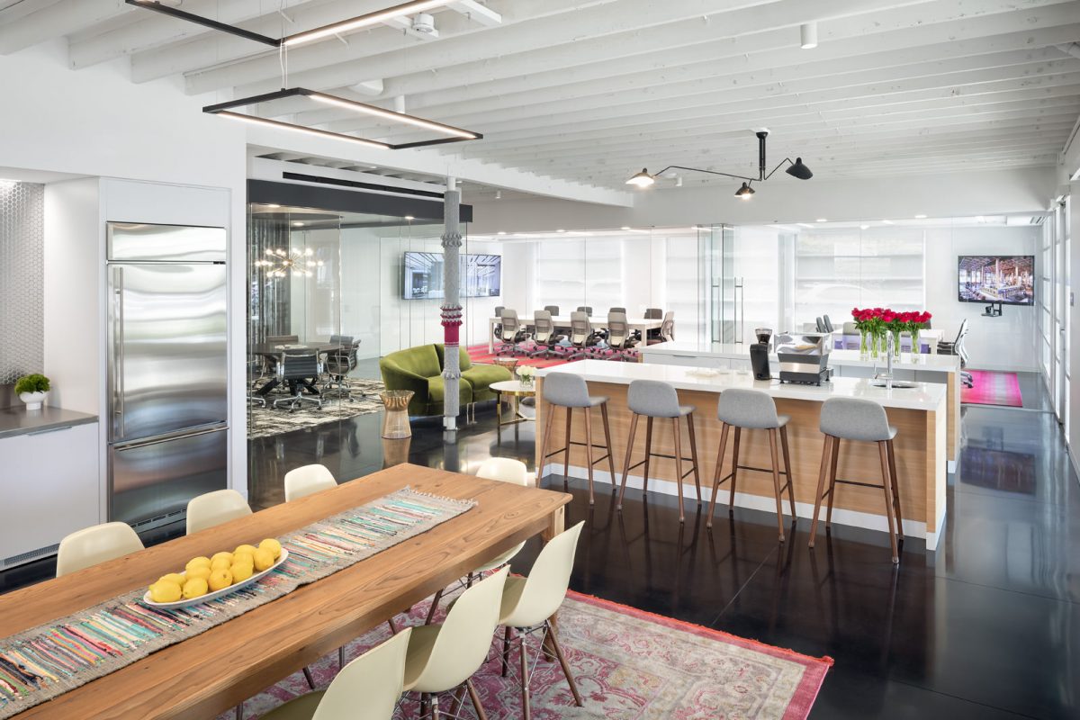
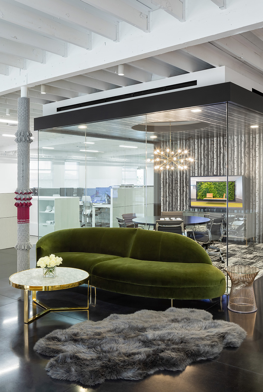
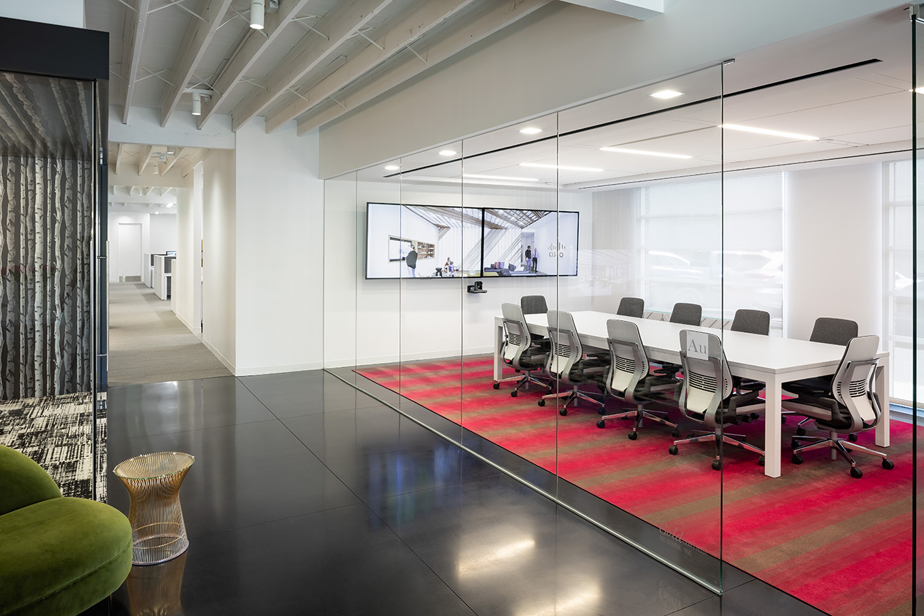
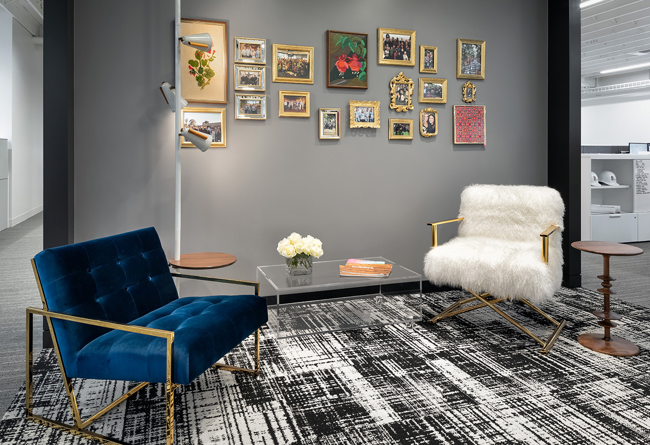
Playing off the concept of “Glamma Chic,” the office has a welcoming, residential feel. A palate of white, black, and gray modernizes the space while accents of fiery fuchsia spark interest. Warm elements such as a wood dining table with turned legs, a yarn bomb column, vintage needlepoint artwork, and a family picture wall emphasize a comfortable, playful vibe while sleek brass fixtures and furniture with geometric lines give the space polish.
Removing the existing dropped ceilings, exposing the joists, and painting the ceilings white brightened the space. To mitigate noise, a flat, white acoustical treatment was added between the joists for a tailored appearance. Additionally, conduits were meticulously hidden behind beams to give the open ceilings more of a residential, loft appearance. Lighting was carefully selected to resemble the color and quality of natural light, and a dimming feature automatically adjusts brightness based on the presence of daylight.
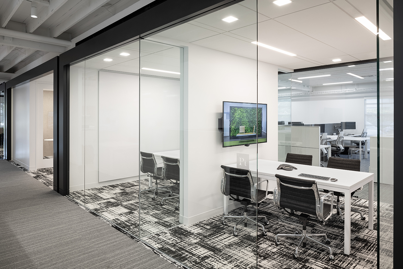
Thoughtful space layout creates opportunities for interaction. Rather than a reception desk near the entry, a concierge island and gathering space invites employees and guests to “come on in.” This area is comprised of a coffee bar, lounge, and kitchen. Adjacent to the lounge is the conference center, with various-sized meeting rooms and advanced audiovisual capabilities to accommodate presentations and remote meetings.
The center core of the workspace is defined by a series of “feature frames” that form a gateway to amenities such as a wellness room, breakout areas, and huddle rooms, while workstations and space for drawings and submittals were configured along perimeter windows to provide employees with ample natural light.
The goal of achieving WELL certification aligns with our values and commitment as a JUST organization. With rigorous performance requirements for air, water, nourishment, light, fitness, comfort, and mind, implementing the WELL Building Standard was a way to further invest in employee health and wellbeing and exemplify what a healthy office looks and feels like. Furthermore, aesthetically pleasing elements that celebrate culture and nurture a human-nature connection positively impact employee comfort, mood, and morale.
